info@clarybillssolution.us
(934) 203-2614
55 Woodbine St, Coram, NY 11727
Responsive Web Designs

Responsive Web Designs
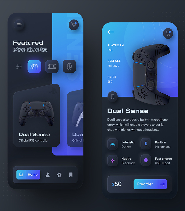
Responsive web design refers to the approach of creating websites that adapt and display optimally on various devices and screen sizes. It involves utilizing flexible layouts, fluid grids, and media queries to ensure that the website’s content and design elements automatically adjust to provide an optimal viewing experience. With responsive web design, websites are accessible and user-friendly across desktops, tablets, and mobile devices, enhancing usability and reaching a wider audience.